Added in WCAG 2.1 to close the 1.4.3 gap: UI component boundaries, icon shapes, and chart elements that carry meaning must clear 3:1 against adjacent color
1.4.11 Non-text Contrast
In Plain Language
1.4.11 Non-text Contrast (Level AA, added in WCAG 2.1) requires a 3:1 contrast ratio between two classes of non-text pixels and their adjacent colors[1]. The first class is user interface components: the visual boundary or indicator that identifies an input, button, checkbox, tab, or focus ring, and the visual difference between its states. The second class is graphical objects: the parts of an icon, chart, or diagram that a user must perceive to understand the content -- the line that distinguishes one data series in a line chart, or the envelope shape on a mail button that carries no text label. The same WCAG 2 relative-luminance formula that drives 1.4.3 Contrast (Minimum)[2] applies here, but the threshold drops from 4.5:1 to 3:1 because non-text shapes are larger and carry less fine detail than body text.
Why It Matters
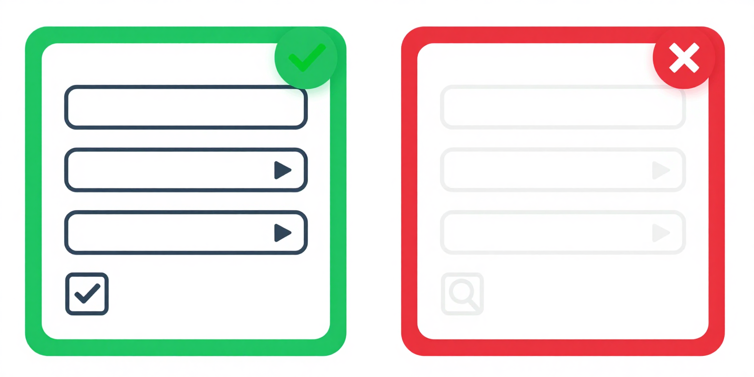
- The canonical failure is a 1px input border set to
#ccccccon a#ffffffbackground. That pair measures 1.6:1 against white, well under the 3:1 floor -- a user with low vision cannot locate the field boundary, so the form has no visible affordance for "type here." - The fix is arithmetic, not aesthetic: darken the border to at least
#949494(3.03:1 against white, the bare minimum) or#767676(4.54:1, comfortable headroom). Computed ratios are not rounded -- 2.999:1 fails[1]. - Custom checkboxes, radios, and toggle switches carry state information in the shape and fill of the control. If the "checked" fill does not clear 3:1 against the surrounding page, the control has a visible box but no legible state -- the user cannot tell selected from unselected.
- Focus indicators are UI components for the purpose of 1.4.11. A 2px outline in the browser default
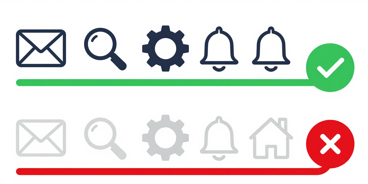
#0000eepasses against white, but a custom#b0d4ffring on a white card fails at roughly 1.5:1 and leaves keyboard users with no visible focus target. - Graphical objects covers chart elements that carry data. A line chart with two series in
#c9d8e8and#d8e8f0on a white plot background fails both 3:1 against the background and the "adjacent color" test between the two lines -- the chart is decorative, not informative. - Exemptions are narrow: inactive (disabled) components, pure decoration, logos and brand marks, and graphics where a specific color is essential to the information (a medical diagram of a rash, a flag)[1]. "We wanted it to look subtle" is not on the list.
- 1.4.11 sits between 1.4.3 (4.5:1 for normal text, 3:1 for large text) and 1.4.6 Contrast (Enhanced) (7:1 for text at Level AAA)[3]. The three criteria use the same formula at three different thresholds; do not confuse them in remediation tickets.
Examples
✔ Border color #6b7f8e on white = 3.9:1 ratio (passes 3:1)
/* Good: border has 3.9:1 contrast against white */
input {
  border: 1px solid #6b7f8e;
}

/* The border defines the UI component boundary */
/* and must meet 3:1 against adjacent colors */✘ Border color #ddd on white = 1.5:1 ratio (fails 3:1 minimum)
✔ Icon color #4b5e6d on white = 5.7:1 (well above 3:1)
✘ Icon color #ccc on white = 1.6:1 (barely visible, fails 3:1)
How to Fix It
- Measure every form-field boundary against its actual adjacent color. The "adjacent color" is whatever pixel touches the component in the rendered page -- usually the page background, but inside a card with a tinted fill it is the card color, not white. A border that passes 3:1 on white can fail 3:1 on
#f7f7f7. - Audit informative icons, skip decorative ones. If the icon carries meaning not duplicated in adjacent text (a magnifying-glass button with no "Search" label, a status dot next to a username), it is a graphical object and must clear 3:1. An icon that sits beside a redundant text label is decorative for the purposes of 1.4.11 and is exempt[1].
- Test every interaction state. Default, hover, focus, active, and selected each need their own contrast check against the adjacent color at that moment. Disabled states are exempt -- 1.4.11 explicitly excludes inactive components[1] -- but do not use that exemption to justify an ambiguous "almost disabled" look.
- Scope the UI-component rule correctly. It covers buttons, links (where the link is identified by something other than color alone -- see 1.4.1 Use of Color[4]), form fields, checkboxes, radios, sliders, tabs, toggles, and focus rings. It does not cover element contrast on text -- that is 1.4.3[2].
- Use the same relative-luminance formula as 1.4.3, just with a 3:1 target. A DevTools color picker or any contrast checker that implements WCAG 2 contrast will do -- drop the threshold from 4.5:1 to 3:1 and check the pair that actually appears on screen, not the design-token value.
References
- [1] W3C (2023). Understanding Success Criterion 1.4.11: Non-text Contrast. W3C, Accessed 2026-04-07. https://www.w3.org/WAI/WCAG22/Understanding/non-text-contrast.html ↩ ↩ ↩ ↩ ↩
- [2] W3C (2023). Understanding Success Criterion 1.4.3: Contrast (Minimum). W3C, Accessed 2026-04-07. https://www.w3.org/WAI/WCAG22/Understanding/contrast-minimum.html ↩ ↩
- [3] W3C (2023). Understanding Success Criterion 1.4.6: Contrast (Enhanced). W3C, Accessed 2026-04-07. https://www.w3.org/WAI/WCAG22/Understanding/contrast-enhanced.html ↩
- [4] W3C (2023). Understanding Success Criterion 1.4.1: Use of Color. W3C, Accessed 2026-04-07. https://www.w3.org/WAI/WCAG22/Understanding/use-of-color.html ↩